Author Topic: forums new look  (Read 27022 times)

0 Members and 1 Guest are viewing this topic.

Re: forums new look
« Reply #45 on: March 13, 2014, 10:47:20 AM »

Offline Kevin OConnor

  • Payton Pritchard
  • Posts: 116
  • Tommy Points: 24
  • @KevinOConnorNBA
Sorry, don't like it one bit.  Hate it every bit as much as the front page. The front page change a while back was the main reason I refuse to frequent that section of the blog anymore.
You're missing out on a lot of great conversation and content. Wish you'd give it a chance.

As for the change to the forums, I don't use them much, but I really like them.
www.twitter.com/KevinOConnorNBA

I like sports and music.

Re: forums new look
« Reply #46 on: March 13, 2014, 10:48:28 AM »

Offline Prof. Clutch

  • Bailey Howell
  • **
  • Posts: 2199
  • Tommy Points: 237
  • Mind Games
It always takes me some time to get used to these kinds of changes.  That being said I like where the new layout is headed.   Everything seems cleaner and I can actually understand who is quoting who in the posts now.  I do agree that maybe reducing the amount of white space or framing the individual posts a little bit more could help improve the overall look, but I like it.

Great work Roy and everyone else who put in the hours to make this change!

Re: forums new look
« Reply #47 on: March 13, 2014, 11:04:30 AM »

Offline Yoki_IsTheName

  • Ed Macauley
  • ***********
  • Posts: 11134
  • Tommy Points: 1304
  • I'm a Paul Heyman guy.
I thank everyone involved to whoever changed the layouts. I for one am glad that there is now a separate "Fantasy Draft Topics".

With that said, Just me, I think I like the old layout better. Don't really know why, but just does.

Doesnt mean I dont appreciate the work though. Thank you.
2019 CStrong Historical Draft 2000s OKC Thunder.
PG: Jrue Holiday / Isaiah Thomas / Larry Hughes
SG: Paul George / Aaron McKie / Bradley Beal
SF: Paul Pierce / Tayshaun Prince / Brian Scalabrine
PF: LaMarcus Aldridge / Shareef Abdur-Raheem / Ben Simmons
C: Jermaine O'neal / Ben Wallace

Re: forums new look
« Reply #48 on: March 13, 2014, 11:12:24 AM »

Offline Celtic

  • Ray Allen
  • ***
  • Posts: 3770
  • Tommy Points: 55
  • TRANSFORMATION INTO CHAMPION COMPLETE!!!
It's terrible, I hate it, I'm never coming back!!!!!

Actually it's a bit of an improvement, although I think it still needs some tweaking.

I'm a web designer/developer and these are my suggestions:

1. Match the header font to the SBNation font used in the very top header (where it says, "HOME FANPOSTS FANSHOTS etc."

2. Some semblance of a separation between posts is required, everything is bleeding together right now, I find myself blurring my eyes while reading. The alternating grey-white posting backgrounds on the old forums was effective. You've used the grey background on the "menu" "latest forum topics" sections to break up the space, something is definitely needed. Perhaps repeat the green horizontal bar? Just scroll down a topic and you'll notice that a quote breaks up the page and provides an anchor, this is what is required with each post.

3. Don't be afraid of color. Sure too much is not good, but the page is really barren as is. Minimalism is a form of design but it's not always the best, most times it's just the easiest to achieve, particularly by non-designers.

Those are my suggestions, the new look  of the forums is headed in the right direction but it's definitely not there yet.

Re: forums new look
« Reply #49 on: March 13, 2014, 11:20:49 AM »

Offline Jeff

  • CelticsBlog CEO
  • Paul Silas
  • ******
  • Posts: 6673
  • Tommy Points: 301
  • ranter
It's terrible, I hate it, I'm never coming back!!!!!

Actually it's a bit of an improvement, although I think it still needs some tweaking.

I'm a web designer/developer and these are my suggestions:

1. Match the header font to the SBNation font used in the very top header (where it says, "HOME FANPOSTS FANSHOTS etc."

2. Some semblance of a separation between posts is required, everything is bleeding together right now, I find myself blurring my eyes while reading. The alternating grey-white posting backgrounds on the old forums was effective. You've used the grey background on the "menu" "latest forum topics" sections to break up the space, something is definitely needed. Perhaps repeat the green horizontal bar? Just scroll down a topic and you'll notice that a quote breaks up the page and provides an anchor, this is what is required with each post.

3. Don't be afraid of color. Sure too much is not good, but the page is really barren as is. Minimalism is a form of design but it's not always the best, most times it's just the easiest to achieve, particularly by non-designers.

Those are my suggestions, the new look  of the forums is headed in the right direction but it's definitely not there yet.

Good stuff.  Thanks for the specific feedback.
Faith and Sports - an essay by Jeff Clark

"Know what I pray for? The strength to change what I can, the inability to accept what I can't, and the incapacity to tell the difference." - Calvin (Bill Watterson)

Re: forums new look
« Reply #50 on: March 13, 2014, 11:21:28 AM »

Offline bdm860

  • Rajon Rondo
  • *****
  • Posts: 5988
  • Tommy Points: 4593
Fantasy Draft Topics having it's own section is the best new feature I see.

Right now, there's just 2 topics showing there, is that a fixed amount, or will it change as there is more activity?

Personally I think it would be great to take that separation a step further, add a couple of more sections ( and maybe get rid of the "Welcome to CelticsBlog" section. Does any poster new or old really pay attention to that?).

Announcements, Celtics Basketball, Around the League, and Beyond the Association, CelticsBlog (comments & remarks) in one combined Latest Forum Topics section. (Because some people just want to talk basketball).  Then break the rest out into:

All Other Sports

Off topic (movies, music, video games, etc.)

Current Events

Fantasy Sports


I think that way, better chance of topics you're interested in not getting buried.  Or topics you're not interested in always clogging up the latest topics.

FYI - I see two different "Pick 2" threads in the latest forum topics section.  I would think they should only be showing up in the Fantasy section?
« Last Edit: March 13, 2014, 11:33:19 AM by bdm860 »

After 18 months with their Bigs, the Littles were: 46% less likely to use illegal drugs, 27% less likely to use alcohol, 52% less likely to skip school, 37% less likely to skip a class

Re: forums new look
« Reply #51 on: March 13, 2014, 11:41:02 AM »

Offline Sketch5

  • Ray Allen
  • ***
  • Posts: 3224
  • Tommy Points: 280
It's terrible, I hate it, I'm never coming back!!!!!

Actually it's a bit of an improvement, although I think it still needs some tweaking.

I'm a web designer/developer and these are my suggestions:

1. Match the header font to the SBNation font used in the very top header (where it says, "HOME FANPOSTS FANSHOTS etc."

2. Some semblance of a separation between posts is required, everything is bleeding together right now, I find myself blurring my eyes while reading. The alternating grey-white posting backgrounds on the old forums was effective. You've used the grey background on the "menu" "latest forum topics" sections to break up the space, something is definitely needed. Perhaps repeat the green horizontal bar? Just scroll down a topic and you'll notice that a quote breaks up the page and provides an anchor, this is what is required with each post.

3. Don't be afraid of color. Sure too much is not good, but the page is really barren as is. Minimalism is a form of design but it's not always the best, most times it's just the easiest to achieve, particularly by non-designers.

Those are my suggestions, the new look  of the forums is headed in the right direction but it's definitely not there yet.

Good stuff.  Thanks for the specific feedback.

I agree with this. Everything runs together and needs some separation between posts. A nice semi thick boarder line in between  would do wonders.

Re: forums new look
« Reply #52 on: March 13, 2014, 11:45:54 AM »

Offline moiso

  • Tiny Archibald
  • *******
  • Posts: 7642
  • Tommy Points: 441
I agree with a couple posters that the screen looks too white.  Maybe I'll wear sunglasses to avoid going snowblind. :)

Re: forums new look
« Reply #53 on: March 13, 2014, 12:20:15 PM »

Offline KGs Knee

  • Frank Ramsey
  • ************
  • Posts: 12749
  • Tommy Points: 1544
sounds like a caching problem - try to clean up your cookies and reboot and all the usual things

I'll give this a shot later and report back.

In school most of the day, so I won't be able to get back to my computer until later today.


Ok, I lied....well, not lied, but didn't think I'd have time to hop on my computer (lunch break).

Turns out clearing the cookies was all it took to get the "quote" button back.


Still not in love with the new look, but I guess I'll just have to accept it and move on ( not away :-* ).  Interestingly enough, it doesn't look any where near as 'bad' on my phone as it does on my computer.


On another note, still having problems with getting the correct time to display, which has existed since the last 'updates'.  I've just gotten accustomed to adding 4 hours to whatever time is displayed.  This problem also exists on my phone still too.

Re: forums new look
« Reply #54 on: March 13, 2014, 12:27:59 PM »

Offline bobbyv

  • Jaylen Brown
  • Posts: 522
  • Tommy Points: 32
I like it. Could use some more work, but it's more modern. I'm curious as to what web frameworks you guys use. I'm learning Ruby on Rails at the moment.

Re: forums new look
« Reply #55 on: March 13, 2014, 12:33:34 PM »

Offline 33-00-32

  • Jim Loscutoff
  • **
  • Posts: 2792
  • Tommy Points: 2746
  • 2012 PAPTBG & 2013 PAPOUG CHAMPION


On another note, still having problems with getting the correct time to display, which has existed since the last 'updates'.  I've just gotten accustomed to adding 4 hours to whatever time is displayed.  This problem also exists on my phone still too.

Updating an earlier comment where the times were corrected...they were at that time and now they're not. I'm blaming KGK's cookies!
G:Kemba,Payton,Hairston,Henderson,Lin
F:Parker,MKG,Budinger,Mirotic,Salmons
C:R.Lopez,Biyombo,Hickson
Coach: Shaka Smart
Rights to: Bog Bog


Re: forums new look
« Reply #56 on: March 13, 2014, 12:40:32 PM »

Offline Gainesville Celtic

  • Rajon Rondo
  • *****
  • Posts: 5544
  • Tommy Points: 1331
  • Ainge *still* has a Posse! Ubuntu Y'all
As a fellow designer.....

(1) kudos to all the hard work that went into the redesign. Love it or hate it (i'm generally fine with it), it was a lot of work for a lotta folks I'm sure; Keep in mind folks there is a TON of pieces of content to have to account for when redesignign the forums....

and

(2) i'm gonna agree with Celtic on his 2nd point and add 2 of my own.


2. Some semblance of a separation between posts is required, everything is bleeding together right now, I find myself blurring my eyes while reading. The alternating grey-white posting backgrounds on the old forums was effective. You've used the grey background on the "menu" "latest forum topics" sections to break up the space, something is definitely needed. Perhaps repeat the green horizontal bar? Just scroll down a topic and you'll notice that a quote breaks up the page and provides an anchor, this is what is required with each post.


I do think something (space, line, etc.) to separate posts a bit would help. Unlike Celtic I don't mind the lack of color -- esp. b/c there so much (and varied) color via avatars and sigs.

-------------

My 2 feedback pieces:

1. I'd lose the box-shadow on the quotes. It is VERY distracting and adds alot of unnecessary visual clutter IMO (I also think it's a little cheesy and doesn't fit the otherwise clean layout elements of the forum and the larger SB Nation redesign).

I'd replace it with a single pixel stroke:


2. There's a spacing issue that is really distracting --- and i wonder if a relatively easy tweak would improve readability:


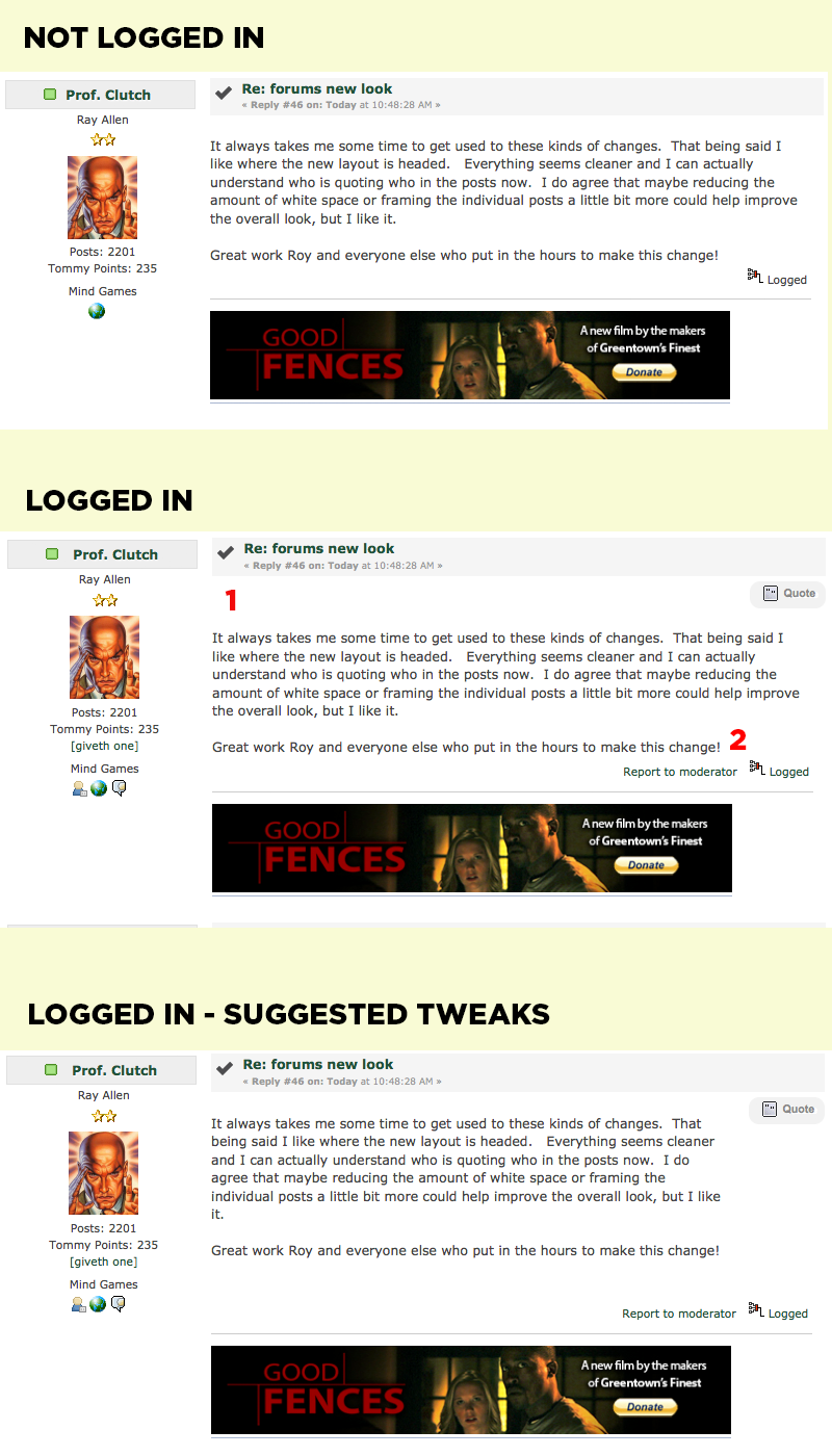
(top-to-bottom a,b,c)

a. When you're not logged in, the main post is situated pretty evenly in the post <div>.

b. However when you're logged in -- which I'm guessing most will be there's a large white space between the header and the post (1), where the QUOTE button get's placed. The post also starts to crowd the (now visible "report to moderator" link).

c. I'd suggest (a) reducing the width of the post <div> to be inside the QUOTE button (say 500 px instead of 590) (b) moving the post up a bit to match the look when you're not logged -- the coding on this is a bit more complicated and (c)  increasing the bottom margin on that post <div> so that there's a little more space for the eye to rest before the "report to moderator" and "logged" links.


These hastily created screen shots look shrunk. I've also attached them if you need em.

Keep up the great work Jeff, Roy, forum folks, et al.
« Last Edit: March 13, 2014, 12:49:36 PM by Gainesville Celtic »
GC's Yahoo! H2h League: Gainesville Celtics: 2014, 2016, 2017 Champs!

GC's Yahoo! H2h League permanent website (offseason roster, constitution, etc.) * Lucky was framed!

Re: forums new look
« Reply #57 on: March 13, 2014, 04:07:40 PM »

Offline LarBrd33

  • Robert Parish
  • *********************
  • Posts: 21238
  • Tommy Points: 2016
I don't really care how it looks... It looks fine to me.  I'm cool with it.

But if there's a separate section for fantasy draft stuff... why are still fantasy threads showing up in "Latest Forum Topics" section?

Re: forums new look
« Reply #58 on: March 13, 2014, 04:12:16 PM »

Offline kozlodoev

  • NCE
  • Kevin Garnett
  • *****************
  • Posts: 17914
  • Tommy Points: 1294
c. I'd suggest (a) reducing the width of the post <div> to be inside the QUOTE button (say 500 px instead of 590) (b) moving the post up a bit to match the look when you're not logged -- the coding on this is a bit more complicated and (c)  increasing the bottom margin on that post <div> so that there's a little more space for the eye to rest before the "report to moderator" and "logged" links.
Why not just moving the quote button in the post header? Makes more sense to me.
"I don't know half of you half as well as I should like; and I like less than half of you half as well as you deserve."

Re: forums new look
« Reply #59 on: March 13, 2014, 04:19:59 PM »

Offline dark_lord

  • Don Nelson
  • ********
  • Posts: 8808
  • Tommy Points: 1126
its not great and its not bad.  will take time to get used to. 

one thing i really dont like is that it is too white/bright.  strains the eyes and makes reading uncomfortable.